Talking about trends in early 2021 may seem somewhat redundant. It seems as though our personal and professional lives will simply continue to be steered by that virus we’re all so tired of. Granted, the fast-growing importance of UX and UI is at least partly due to the sudden digital shift COVID-19 has demanded from us all. If we are all going to use digital interfaces to collaborate, communicate and coexist, then let’s at least optimize. That’s where design comes in. Pinky promise: no more virus-talk below, COVID- or otherwise…

Here are the UX/UI design trends that we think will catch on… and (just to mix it up a little) the ones that won’t, even though many people actually expect them to.
UX/UI trend to be – Minimalism with a hint of flamboyance
Fashion is always a barometer of what trends will soon trickle through to the online world as well. Minimalistic styles have undeniably found their way to many wardrobes. Other offline brands have picked up on the trend as well. The relative novelty of online has always provoked a somewhat exuberant style for websites and online platforms. However, people are more than ready to go back to basics in the online world as well. In times of information overload, less is more.
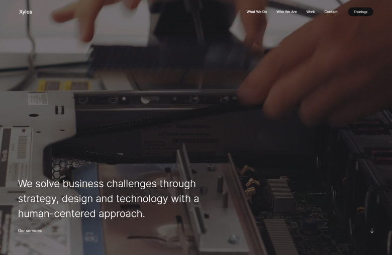
We adopted that principle ourselves very recently when we developed the new website for Xylos. We used a font type that takes it easy on the boldness. The idea behind it is literally making the information lighter and easy to read, instead of disorienting the reader with in-your-face boldness. This strategy still draws the desired attention thanks to the use of space and contrasts in text color (black vs. grey). Apple also tends to apply this best practice in its web design: a reliable reference for the approach.
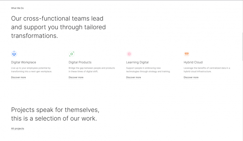
Another expression of minimalism is the following: due to the growing obsession with Conversion Rate Optimization (CRO), more and more innovative companies choose to communicate only a single key message on their website’s homepage. A good example is DAUM&CO. This approach chooses to trigger the visitor with minimal information, as opposed to trying hard to get the visitor to understand everything the company does at once. The latter approach often only ends up overloading the person with information or at best oversimplifying the company’s actual activities.
To avoid minimalistic websites from becoming too basic, web designers often choose to add just a little touch of flamboyancy. Often that touch is found in the transitions between website pages (or only at the very beginning when a page is loaded). In other words: not where or when the visitor is trying to read or absorb information. Examples are Tesla or again Apple.
UX/UI trend NOT to be – Neumorphism
Dynamic depth or Neumorphism is one of those interface design trends that didn’t quite catch on. We believe that’s not going to happen in 2021 either. Neumorphism mimics real-world (often technological) objects on the screen. Many designers like it because it’s exciting and creative to realize. But in the end, the customer (end-user) is king. End users don’t get all the excitement that goes into creating this style.
End users know very well that they’re not in the real world when they are on a digital platform, so they don’t expect it to truly simulate reality. When neomorphism is forced upon them and the readability of the website is substituted for gimmicks, they tend to opt out. In other words, they just don’t feel it and want to simply move on.
UX/UI trend to be – Glassmorphism, branded iconography and beyond
Even though we think neomorphism as such will not catch on, there is a similar (sub)trend called ‘glassmorphism’ we probably will at least play around with a little bit at Bagaar. Unlike Neumorphism which imitates depth, while to the eye everything still remains on a single layer, glassmorphism actually achieves a multilayer effect, thanks to transparency and blurriness effects.
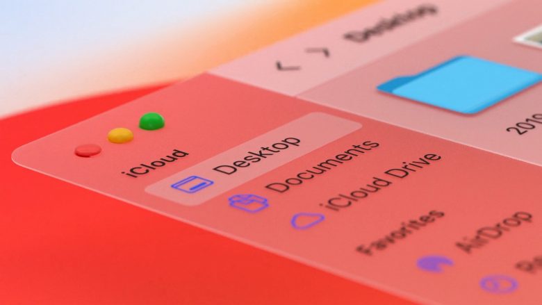
Apple’s latest software release Big Sur is not only a good example of glassmorphism. It is also a good example of how to apply glass morphism. That is: not using the effect on every single screen but when it brings added value: when your interface needs some hierarchy, for example. Hopefully, web designers will use glassmorphism intelligently. From some of the work we’re discovering online we’re confident many of them are catching on quite well.
The hamburger menu icon has earned its spurs over the years. Its success lies in the fact that it is used so widely. Love it or hate it, an end user knows what to expect from it. However, as icons become a bigger part of brand book guidelines and designers have the possibility to animate them, we expect customized icons to become a trend. A nice example is Orangina.
Some brands even go beyond iconography. A competitor for Moleskine, Karst Stone Paper, has designed its own unique font that is reflected on its website.
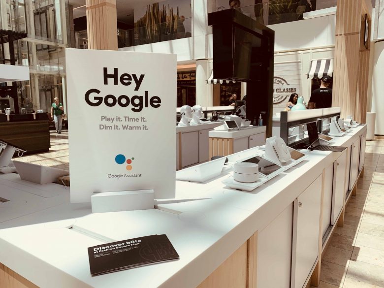
UX/UI trend NOT to be – Voice user interfaces
Now, when we say “not to be”, we mean: not right away, here in Europe. Voice user interfaces are more and more adopted in the US thanks to Amazon Echo devices and other devices with “Siri” or “Hey Google”. If the trend really picks up in the US, surely it will find its way to Europe but it will take a little bit of time, simply because Europe is a bit more complicated language-wise.
So, mainstream users literally speak to their phones or let alone, their laptops: we probably will not see it in 2021. But who knows? Working from home might change our adoption behavior more drastically than we anticipate.
UX/UI trend to be – Simplification in user experience
At Bagaar we love user experience and user interfaces. How much, you ask? Let’s just say we love it so much, that we really hate bad UX/UI. Our therapist told us to find an outlet in sarcasm so we made a little website for everyone to see what we mean when we get so angry about bad UX/UI.
And we notice we are not alone. Many digital services are simplifying their user experience these days. This is a trend we welcome very much and believe will continue fiercely in 2021. An example? Simplified registration. Facebook is the one that started it all a while back. A service like HubSpot just asks the user three simple questions. We say: why not make it even easier by just asking for your name and e-mail? Either way, the trend is developing and with multi-factor authentication, we can keep things secure.
UX/UI trends NOT to be – Over-animated displays, A/R-V/R and hidden navigation.
There’s animation and there’s animation. Whether animation is a good choice? Well, UX/UI designers can get pretty animated in that debate. On one hand people like a dynamic website that feels alive. The question is: “should everything be moving?” And there seems to be some pretty strong consensus that the answer is “no”. Animation can make a website a tad more interactive but sometimes it only contributes to a bad user experience. This website, for example, is pretty creative but it has some quirky animations that aren’t necessary. It tries to bring itself to life with animation that doesn’t improve the overall user experience and actually only distracts the visitor.
Another sin that this website commits is: hiding the navigation (or at least not letting the menu stand out much). Sometimes, it’s understandable to give as much space as possible to an important video or animation that carries out your identity and brings things to life but it shouldn’t be counterproductive. You always want your visitor to discover as much as possible. So, at least tease them a little to go below the fold. Just a little arrow can do wonders. Exhibit A: once again, the homepage of the Xylos website we recently developed.
Speaking of bringing things to life. Another trend that has been pushed by a lot of big corporations but just hasn’t really reached anyone except for early adopters: augmented reality and virtual reality. So what does this mean for UX or UI design? We have to keep it in the back of our heads. A lot of meetings take place virtually today and depending on how the pandemic evolves, end users might develop more urges for augmented- and virtual reality as they work from home. If things evolve as we all hope and the pandemic goes away, the AR/VR trend will surely not really pick up just yet. Ok, so we almost made it to the end of the article without bringing up COVID-19. Please, forgive us and let us know what you think will (not) be trending in UX/UI design this year.
Do you have a UX/UI Project in mind?