By 2030, the City of Ghent has the ambition to make its residential properties consume 30% less energy. To reach this goal, the city wants to guide its inhabitants in their energy renovations and has already been providing free at-home renovation advice for some time. Now, with the help of Verhaert, it wants to develop a prototype of an open, interactive, and easy-to-use dashboard in which citizens can plan and monitor their renovations.
Supporting energy renovations in the City of Ghent
Because the City of Ghent wants to reduce energy consumption, it wants to build on its current renovation support. ‘De Energiecentrale‘ already offers citizens free at-home renovation advice services and a webpage. Which contains valuable tips, an extensive renovation guide, and information on loans and grants. To complement this, the City of Ghent, supported by VLAIO and the City of Things, requested our help to develop a dashboard prototype. The goal is to help its citizens reduce their energy consumption and make following up on renovation plans easier.
The strategy
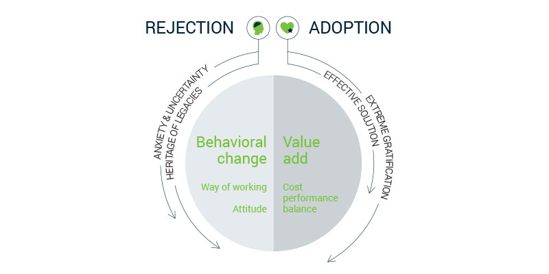
On the one hand, we intended to develop an attractive interface, one that is easy to use, applicable on all kinds of devices, easy to read, etc. In short: a user-friendly interface where we deployed our design expertise and guidelines. The second objective, if not even more important than the first, lies in the effectiveness people will reduce or start to reduce their energy consumption.
User reflection & adoption model ©VERHAERT
The intended reduction is very high and we’ll have to realize it over the different persona and types of homes. To this end, we first define this persona as a basis for selecting our workshop participants and validation exercises. Criteria for this are more than just demographic (age, income, family composition, location), it’s also about behavior. The second objective needs to be meticulously designed to avoid rejection of use by the target audience and thus failing to achieve effective energy savings.
User nudging model ©VERHAERT
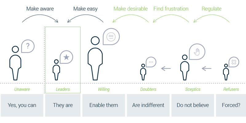
Our experts used cognitive design expertise and behavioral economics expertise to succeed in the second objective. These interventions are developed in a user-specific way. For example, doubters or skeptics require different solutions.
Defining the functionalities of the energy dashboard
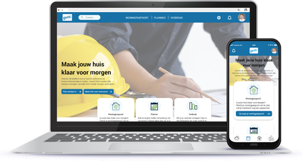
Based on our user research and the criteria of the City of Ghent, we distinguished three main modules within the tool with different goals and functionalities: the house passport, the planner, and the consumption overview.
The first component, the house passport, contains all information on the state of the home. When creating a profile, you’re asked to fill out a questionnaire about the property. Through color codes, users receive a clear overview of which parts of their house urgently need to be replaced or renovated and what the outcome would be in terms of EPC label, energy savings, and budget.
The second component is the planner. Here, users can schedule their activities in a personal planner, as well as consult the neighborhood schedule. This way, they can check whether any road works could hinder their renovation.
The planner seems very intelligent, you are immediately directed to the right page if you want to request a parking ban, for example. ~ Workshop participant
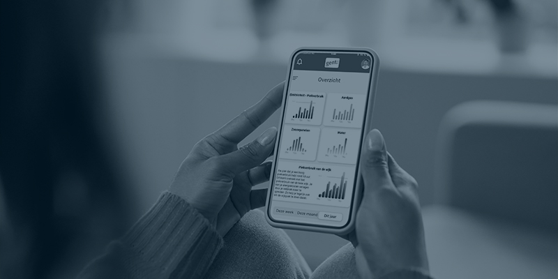
In the third module, users can monitor their consumption. They can connect a digital meter or enter meter readings manually, allowing easy monitoring of the effects on energy consumption. In addition, they can also compare themselves with their neighbors to gain more insights.
By comparing yourself with others in a similar situation, you can learn a lot. Why do they do it better? What adjustments have a significant impact? ~ Workshop participant
Involving the citizens of Ghent
Our innovation and design consultants organized several user research workshops to involve citizens in developing the dashboard. We did this to make sure the platform met not only the needs of the City of Ghent but also those of the citizens, the future users. In the first workshops, we set up mood boards for each of our possible target audiences and mockups of the features. We then verified these with the input of our participants to finetune the main look and feel, and direction of each of the functionalities and features.
Dashboard mock-up ©VERHAERT
Once we had a compelling combination of functionalities, we focused on refining the interface, user experience, and layout. With different working prototypes, participants could test the platform in real-time at an early stage. This allowed us to test the digital experience and interactions, and improve the interface. Thanks to the valuable feedback and insights from each workshop, we could further fine-tune the interface. We could also come up with an intuitive, user-friendly, and service-centric design.
Want to read more? Discover our blog and perspectives!


