All too often, products and services that are technically sound fail to gain traction in the market. Why? They simply don’t offer intuitive handling. Today, users are accustomed to seamless experiences from companies like Apple, Netflix, Airbnb and Paypal, setting high expectations for any digital or hybrid product. Despite this, many companies still overlook the importance of UX. Let’s take a look at the most common misconceptions about UX that lead to its underrepresentation in the development process.

Myth 1: UX = UI
When you ask people to define UX (user experience) design, you often get answers like “Designing clean, modern interfaces” or “Making things look good.” But that’s actually UI (user interface) design. Though they are closely related, UX is about much more than just aesthetics, it’s about designing the entire user journey, both digital and physical.
- UI = How it looks
User interface design refers to the visual and interactive elements of a product, such as buttons, icons, typography, colors, tactile controls, ergonomics and overall layouts. It’s all about how the product looks (aesthetics) and how users interact with it intuitively. - UX = How it works
User experience design is about the overall feel of the product and how easily users can accomplish their goals. It involves research, usability testing, wireframing and interaction design to ensure a smooth, efficient and enjoyable experience.
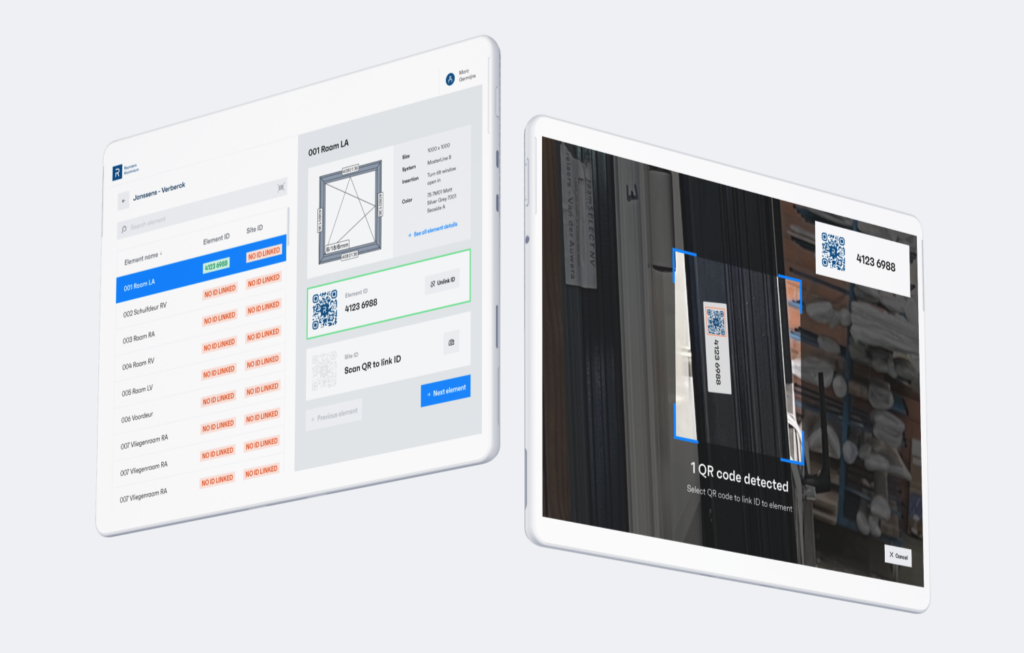
A great example of this came up while we were developing Ordo Key. Initially, the focus was on look and feel, but user feedback quickly revealed that installers found the installation process unintuitive. This insight led to a shift in approach, prioritizing usability improvements to streamline the workflow, proving that UX is not just about aesthetics but about making products truly work for their users.

© Ordo Key
Myth 2: UX is a luxury expense
Thinking of UX as a “nice-to-have” rather than a critical investment can be a costly mistake. Poor UX doesn’t just frustrate users, it can lead to market failure, expensive updates and even brand damage. Some examples? In 2012, Apple Maps launched with inaccurate data, poor navigation and distorted 3D maps. This resulted in Apple’s shares losing 4.5% of their value, price tag: $30 billion. Volkswagen‘s touchscreen-only controls in the 2020s was widely criticized for being frustrating and unintuitive. In the end, the company announced it would bring back physical buttons. In 2018, Snapchat changed the app’s layout in an attempt to make it more user-friendly, but instead, it caused confusion and frustration. The company lost millions of users and stock prices dropped drastically.
If done right, investing in UX becomes a strategic move that generates significant returns. In fact, research from Forrester showed that for every $1 invested in UX, companies can see up to $100 in return. Or to give an example of the value of a product with a great UX, various analysts estimate that the value of Apple’s Airpod business is $195 billion. That is in line with the value of the combined Bel 20, excluding AB InBev (or about twice the value of AB InBev).
Another mistake is thinking UX requires a massive, time-consuming investment, while it actually can be delivered in small, focused sprints, building on a design roadmap defined in initial project brainstorms.
Myth 3: UX is subjective
Let’s set the record straight: UX is not about the designer’s personal preference or ‘what looks good’. It’s about what works for users, based on data and research. UX uses clear, actionable insights gathered from surveys, feedback and real-world usage data. You dive deep into how features are actually being used, identify pain points and understand frequent tasks.
To measure UX success, we rely on hard metrics like task success rate, task duration, NPS (Net Promoter Score), error rates and misclick rates, defined based on the company’s objectives. For Reynaers Aluminium, research was key in finding the right features for their online platform, DigiTrace. As a result, it’s now widely used, has received a lot of positive feedback and has become a key driver for data-driven innovation.
 © Verhaert Digital
Based on a mix of human psychology, usability research, industry best practices and accessibility principles, UX also follows established standards. For example, by following common UI patterns and visual cues (affordances), users don’t have to “learn” a new interface, they can rely on what they already know without needing instructions.
Myth 4: More features = Better UX
Actually more correct would be: More features, more problems. Overloading an app with unnecessary features can overwhelm users, while they crave simplicity and intuitive workflows. In many cases, companies focus more on driving business goals and adding features quickly rather than understanding users’ true needs. The key to great UX is prioritizing the right features, and this starts with research before any development begins.
Alberto Savoia put it perfectly when he said: “You have to build the right it before you build it right”. A great example comes from our work with TEO. Their interfaces had evolved based on customer requests, leading to a variety of workflows and a complex architecture. Based on in-depth research, we helped them refine their design, streamlining features and creating a more structured, intuitive app. Another great example is from Loop. These earplugs are super popular for a reason: They’re a simple product that offers a great experience.
 © Loop Earplugs
Myth 5: Users will figure it out
According to PwC, 32% of users will leave a brand they love after just one bad experience. That’s not very surprising. People expect products to be intuitive and effortless to use, and they don’t want to struggle or waste time trying to understand how something works. So the idea that users will simply ‘figure it out’ how to use it is a recipe for failure.

Take this door, for example. Would you push or pull? Everyone can recall the frustration (or embarrassment) of pulling a door that you should actually push open. In UX, we call this concept the ‘Norman door’, a design that confuses its users, causes errors or functions counterintuitively. It also highlights that UX goes far beyond digital interfaces and apps, it applies to the workflows of any product, service or system. These kinds of frustrations may seem small at first, but when they happen too often, it’s all the user will remember about the product.
Many companies assume they know enough about their users, but there’s a huge gap between being familiar with a product and being a first-time user. This can lead to poor decision-making because what seems obvious to the creator might be confusing or unintuitive for someone who hasn’t spent hours with the product. Thanks to the previously mentioned user research, UI standards and affordances, even a first-time user can use your product intuitively. Creativity is cool, but usability wins every time.
A strategic approach to innovation
The misconceptions around UX can seriously stifle innovation. When companies make decisions based on incorrect assumptions, they end up with products that frustrate users and fail to provide real value. UX is not an afterthought or a luxury; it’s a strategic tool that directly impacts user satisfaction, engagement, and business success. To truly innovate, companies should regularly challenge their assumptions and ensure they understand the real needs of their users. After all, developing a product that doesn’t offer value to the end user will inevitably fail.


